Court Grip
Packaging and retail for a grip product co-developed with Dwyane Wade, sold through Foot Locker nationwide.
Summary
Overview
Court Grip is a sports grip product that launched into national retail stores through Foot Locker and Eastbay. As Art Director at Revolver New York, the job was making packaging and in-store displays earn their place on a crowded shelf. Every choice had to hold up in a real store aisle.
Challenge
Stock images could not sell a product built around an NBA star. The packaging needed its own photos. It also needed sign-off from Mission and from Dwyane Wade's team, and print-ready files on a retail timeline.
Process
Initial mockups with stock images, quickly replaced by a dedicated shoot.
Photo and video session with Dwyane Wade in midtown New York, directed start to finish.
Working with Mission and Wade's team to approve packaging and begin label printing.
Marketing materials and in-store installation for Foot Locker flagship stores.
The Retail Aisle
Mission Athletecare made a liquid traction product for basketball shoes. A player rubs it onto the sole, the dust stops mattering, and the shoe grips the floor again. That is a hard thing to sell from a hook in a Foot Locker, because the product is invisible until someone plays in it.
Revolver New York took the launch in 2011, and the work was packaging and the retail system around it. Every piece had to survive the same test, because a shopper walking an aisle gives it about a second.
A Bottle That Explains Itself
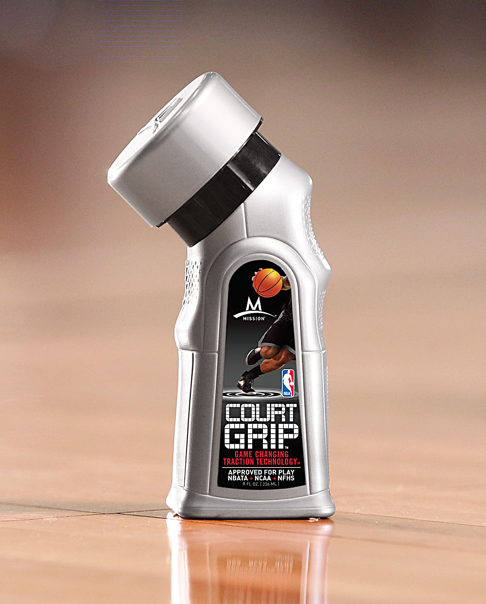
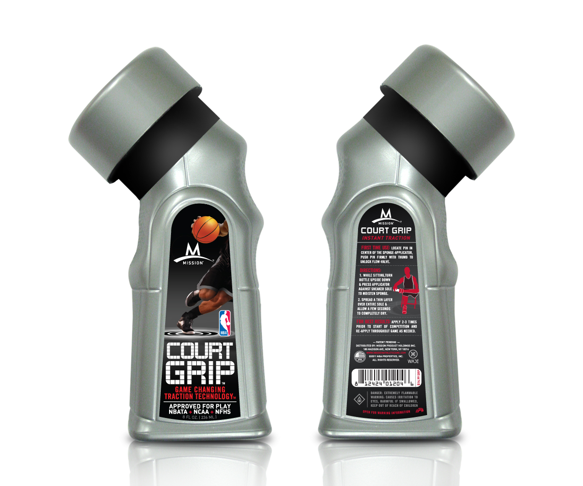
The bottle came molded with a sponge applicator set over at an angle on a black collar, so the shape was fixed before any label was drawn. Die cut to an arch that follows the body, the front label frames a player driving across a dark field, the ball lit like a lamp. COURT GRIP sits in a stencil face under the Mission mark.
Once the box is open, the back half does the selling. Three numbered steps say how to charge the applicator, spread a thin layer, and repeat before each game, with a small red figure demonstrating beside them. The approvals, the volume and the barcode run along the foot where a scanner expects them.
Casting Dwyane Wade
The first mockups used stock images of anonymous players. They were well made, and they could not do the one job the package needed: the claim printed on it was that a named athlete had helped develop the product and played in it, and stock photography cannot carry a name. A shoot was arranged in midtown New York with Dwyane Wade, directed start to finish, with photography and video out of the same day.
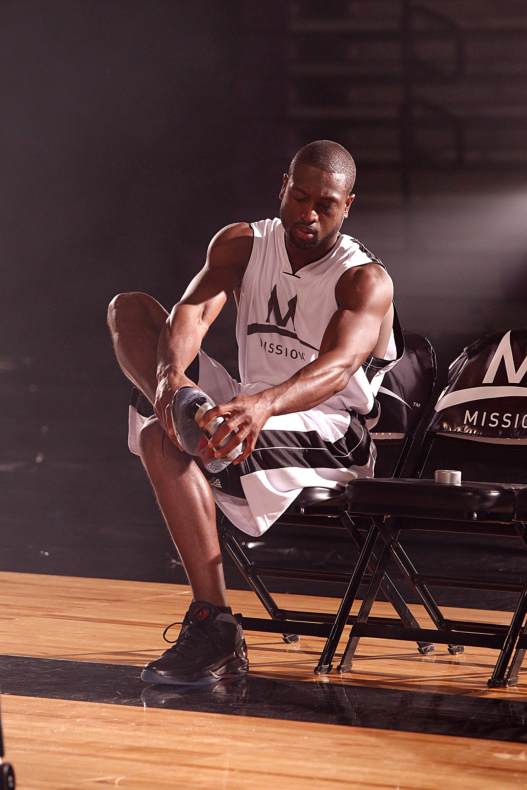
The frame the campaign kept is the quiet one. Wade sits on a folding chair at the edge of a lit floor in a Mission jersey, head down, applying the product to his own shoe while the gym behind him falls away into black. It shows someone using the product rather than endorsing it, and every later piece is cut from this session.
The Courtside Frame
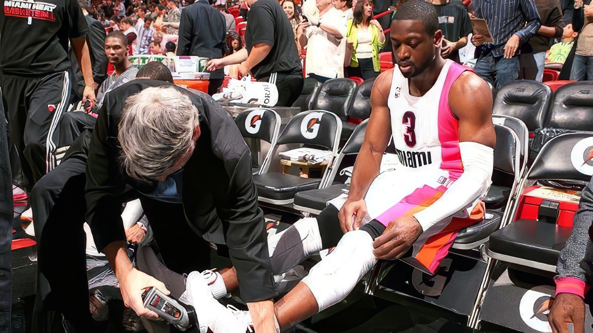
The other frame is not from the session. Taken at a Heat pregame, it has Wade in the pink and orange throwback with his number on it, sitting in the front row while someone kneels at his feet and works the applicator across the toe of a white sneaker. The arena is filling behind them and nobody is looking.
It is the photograph the studio frame was built to imply. One is lit, cleared and composed to put the bottle in an athlete's hands; the other is the same bottle in a stadium aisle before a game, with a trainer holding it. The campaign could only ever print the first. The second is why the first was honest.
The Three Commands
Three short commands carry the campaign: Combat The Dust, Command The Court, Cut With Confidence. Each is a complete thought, so a piece can take one or all three without rewriting.
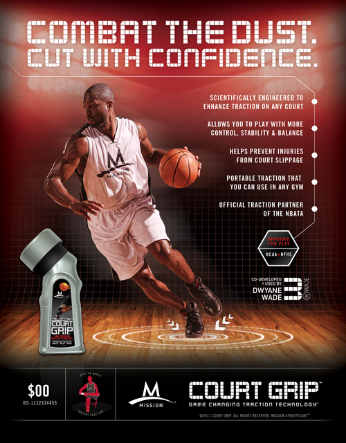
One diagram does the explaining the headlines refuse to do. Concentric rings go into the floor under the player's foot, small arrows breaking outward, marking where the grip happens. The rings return on the sell sheet, the shelf towers and the counter fascia, which is what holds the pieces together when the photographs in them differ.
The sell sheet steps five claims down its right edge, each pinned to the rule beside it. Along the foot sit the things a buyer checks first: price, barcode, the approved for play seal and the co-developed line with Wade's number. Price and barcode stay open for each retailer to set, which is why both carry placeholders here.
Five Pieces, One Structure
Every piece came off one structure, so a store could take any of them on its own and the aisle still read as one campaign.
Floor Towers
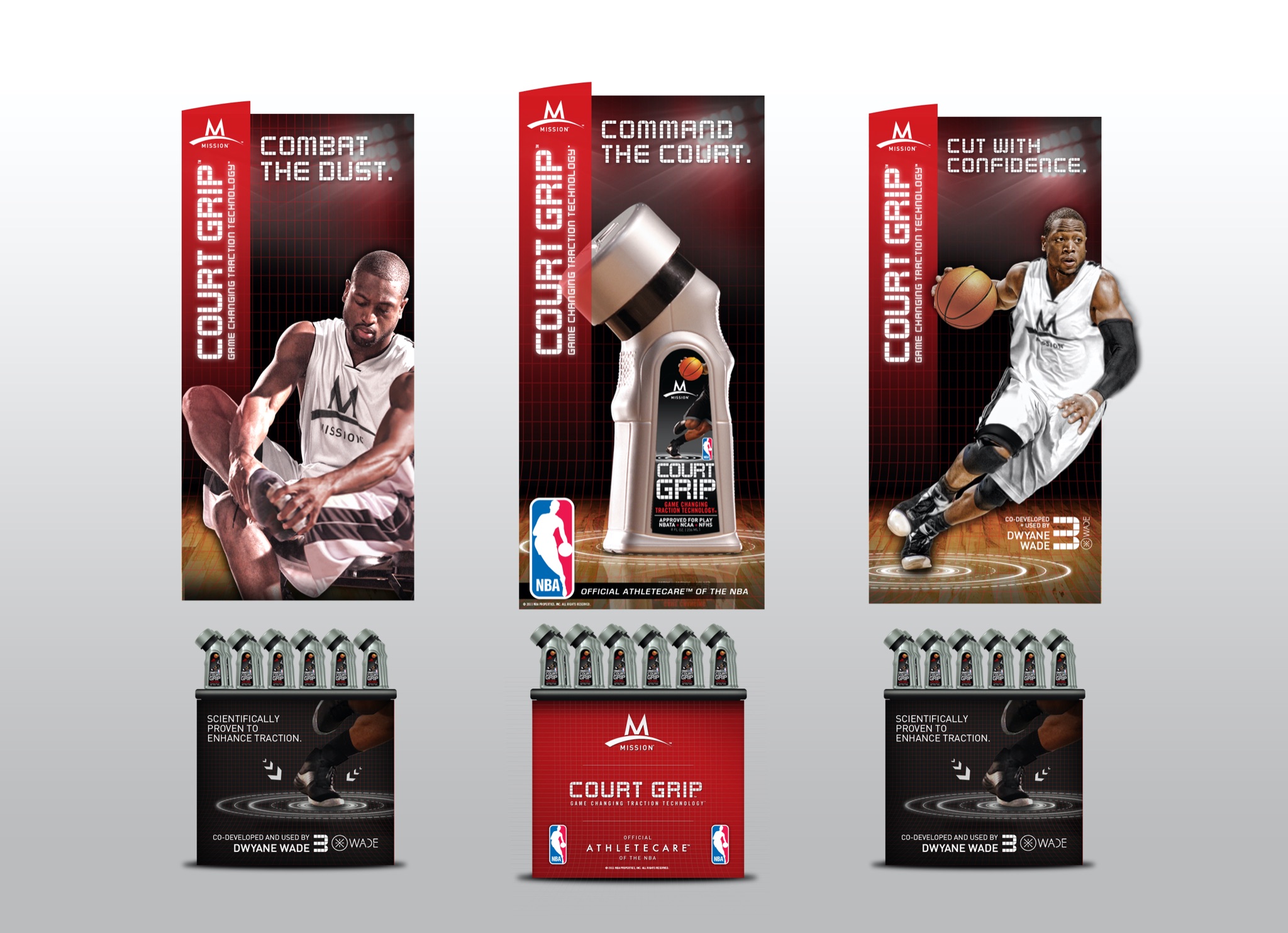
Three tall banners over a tray of six bottles, each taking a red spine with COURT GRIP turned on its side, one of the three headlines and one image. Splitting the message across three rather than printing all of it once is the decision that makes the unit work: a store takes one tower or all three, and each is a finished argument on its own.
The Counter Unit
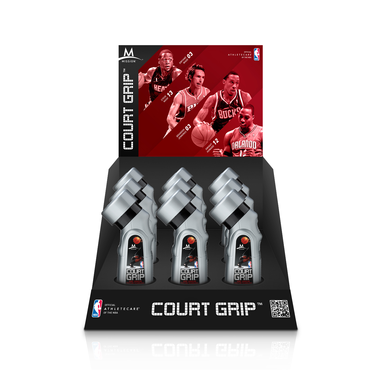
Nine bottles in three wells under a header card, with a fascia carrying the roundel, the name and a scan code. Counter units are smaller and work harder than a floor tower, so nothing on one is decoration.
Power Grip, Same Frame
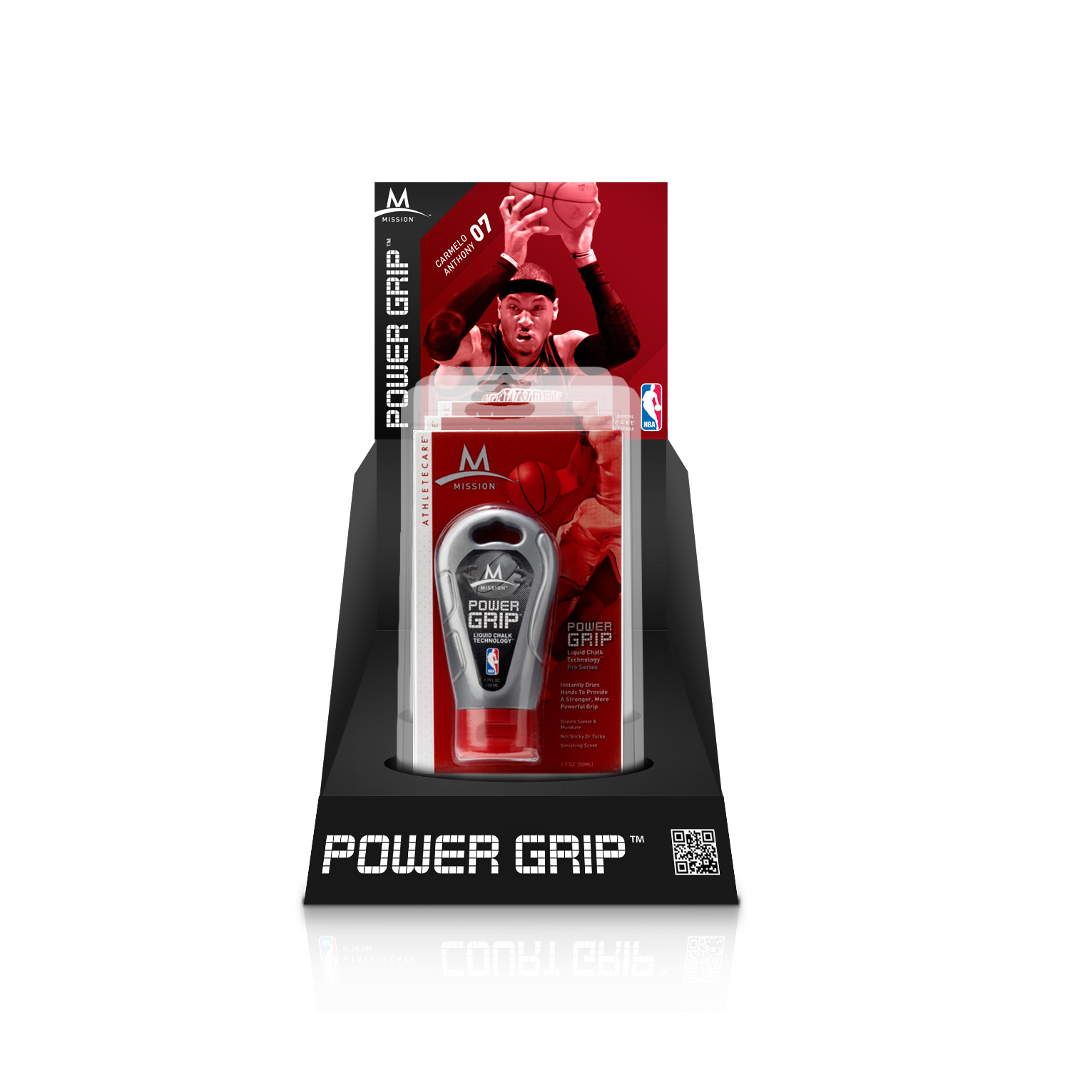
The sibling product for hand grip takes a single blister pack in the same structure. Running both off one frame is what let a second product ship without a second design. The header card changes, the athlete changes, the red changes depth, and the tray, the fascia and the code block stay where a shopper already found them.
The Header Card
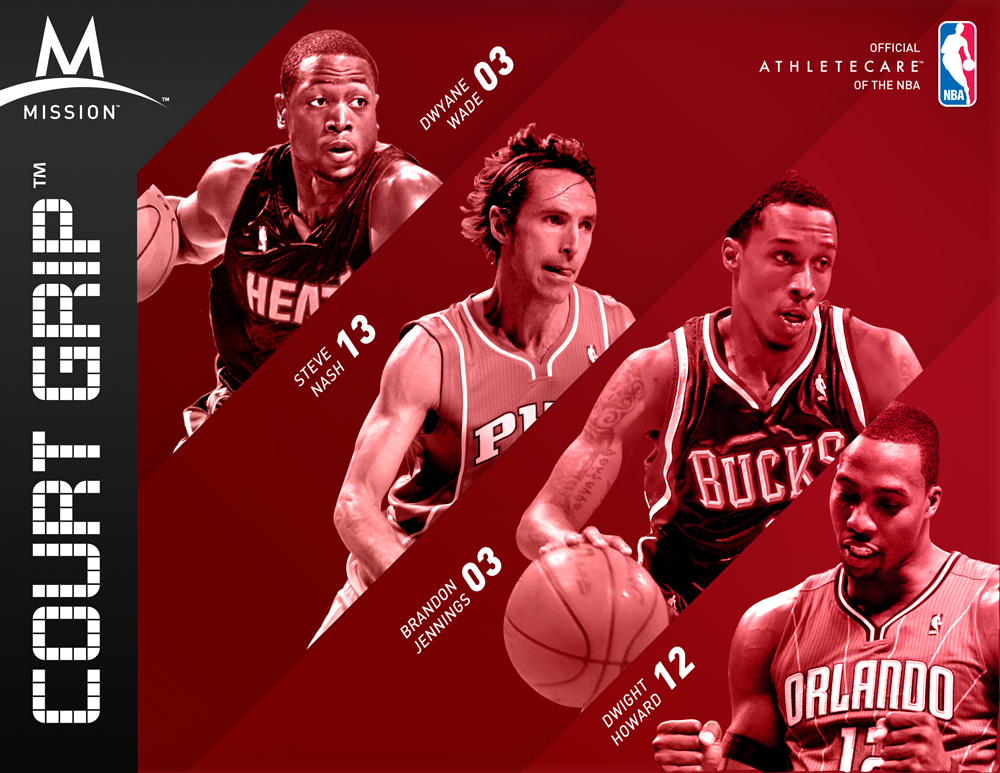
The only piece that is purely a picture. Four athletes cut out along red diagonals, each named with their number set on the same angle, the whole image pushed into a single red so four photographs from four sources read as one. At counter height there is no room for a sentence, so the argument has to be the roster.
The Range Tray
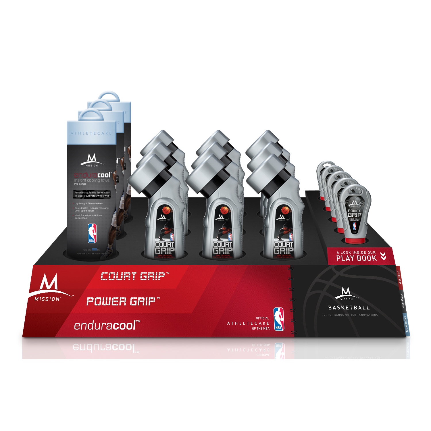
The largest unit puts the whole basketball line on one tray: Court Grip in the middle wells, Power Grip to the right, Enduracool cooling towels at the left, under the Mission Basketball mark. A tab above the Power Grip packs reads A Look Inside Our Play Book, the one line in the system that asks a shopper to do something other than buy.
What Actually Went In
One Foot Locker, 28 September 2011. The kit was drawn as towers, counter units and a range tray. What went in was none of those three, and it still read as one campaign, because the parts were made to be recombined and the retailer's own lockup had somewhere to sit.
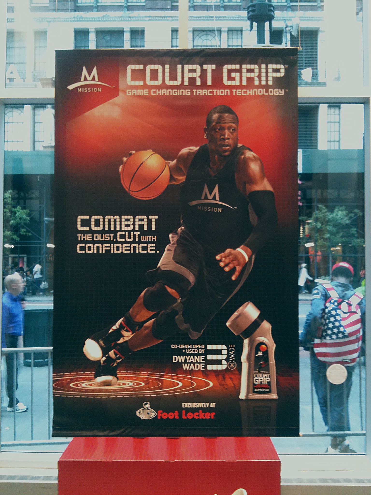
The Window
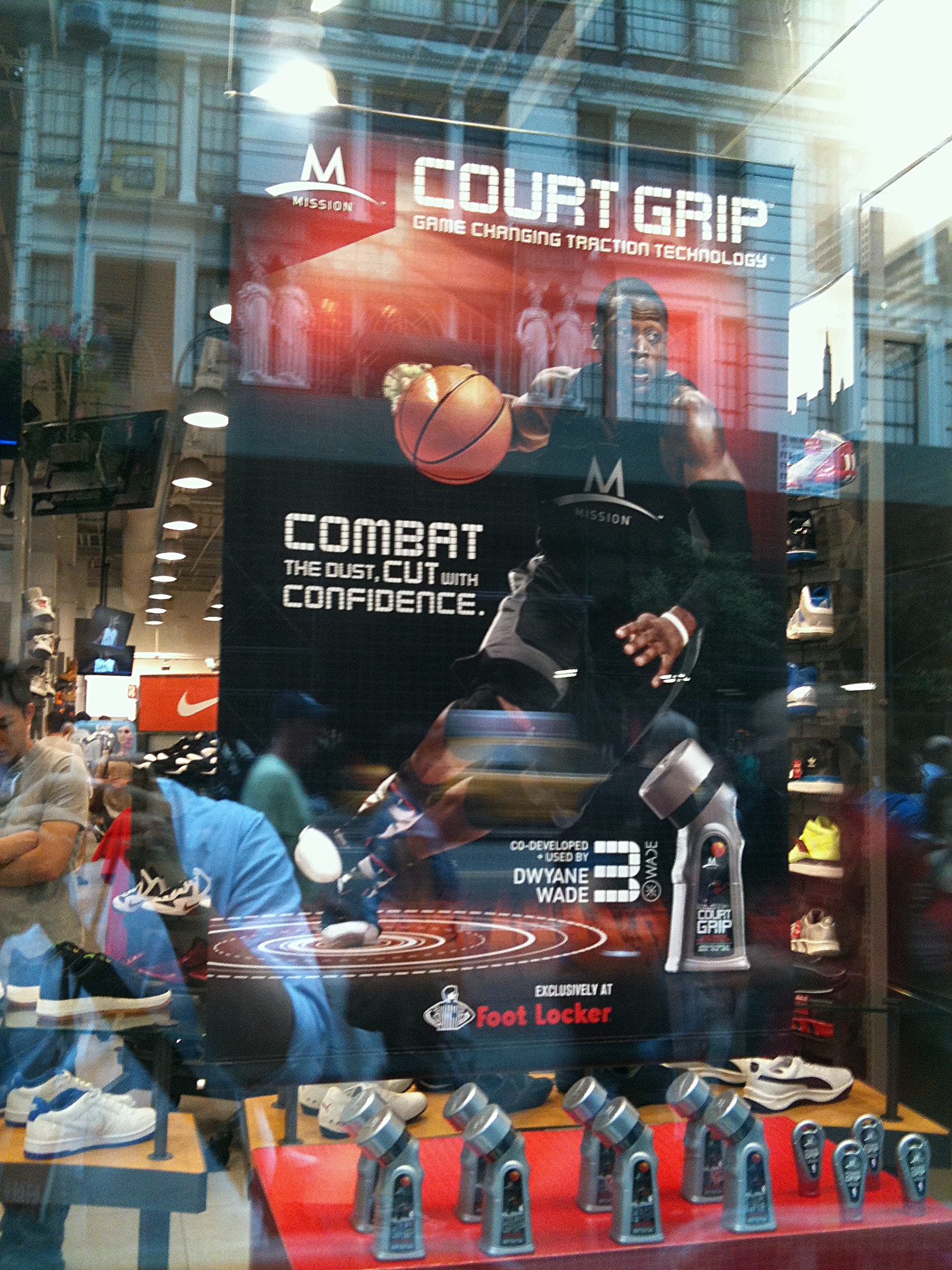
A banner filling the glass, read from the street with the building opposite reflected across it. The artwork was drawn at counter height and held at twenty times the size, with an Exclusively at Foot Locker lockup that none of the drawn pieces had.
The Tray in the Window
The range tray moved out of the aisle and into the display, its own header above it. One piece doing a job it was not designed for, and needing no change to do it.
The Display From Inside
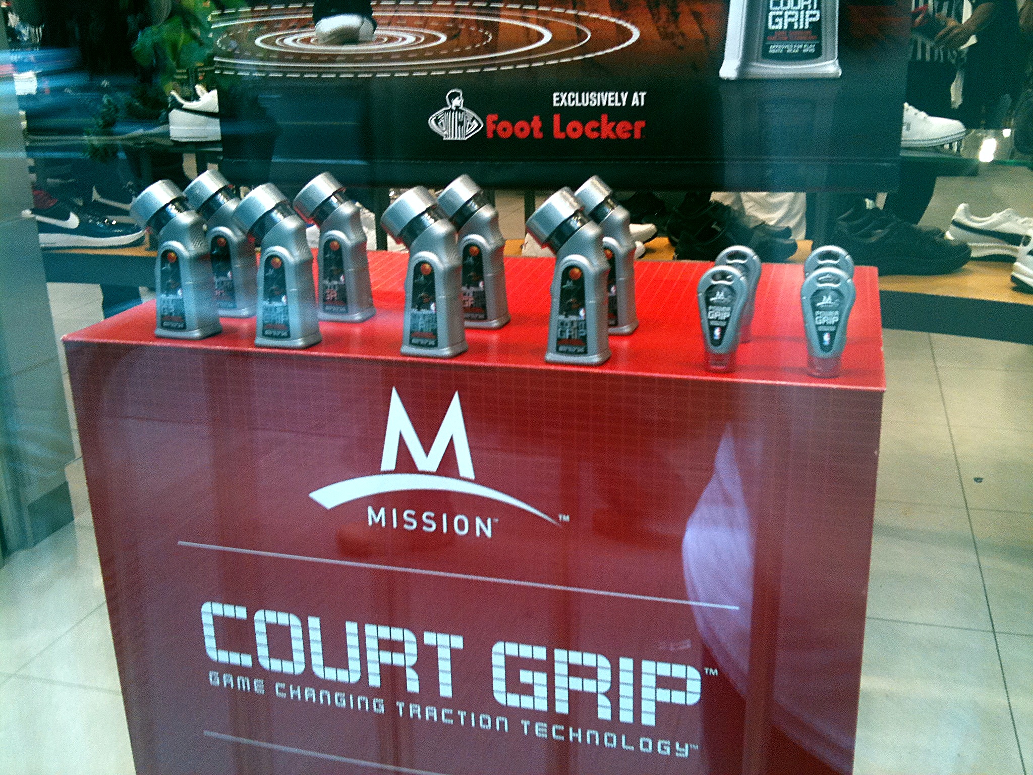
The same display from the shop floor, looking out through it to the street. The red plinth is the back of the thing a passer-by sees from the other side, which is the half of a window display nobody photographs.
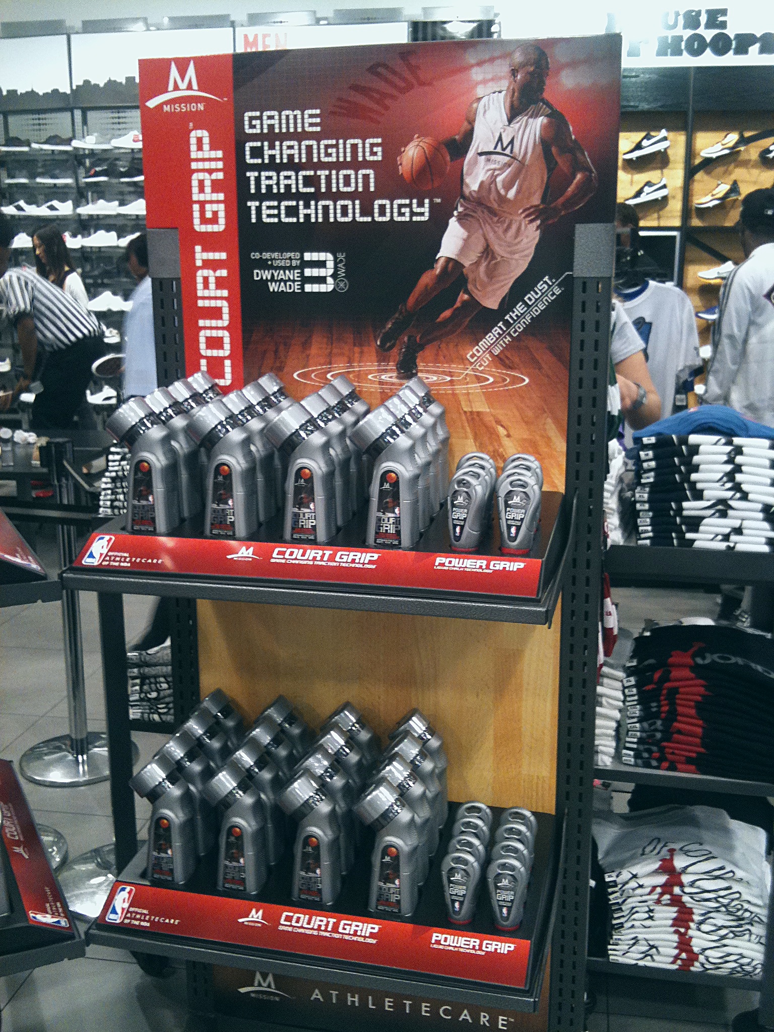
The Gondola
Not a tower and not a counter unit, but a full gondola with its own header, holding both products on one run of shelf. The store built the thing it needed out of parts drawn for other furniture.
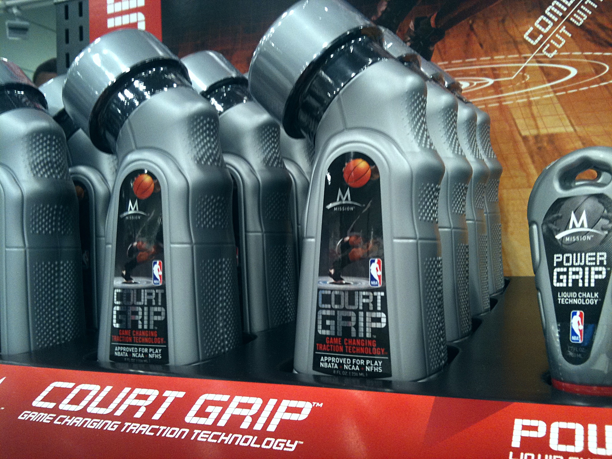
The Shelf Itself
Court Grip and Power Grip together on the tray, which is where the whole system was aimed. Two products, one frame, a hand reaching for either.
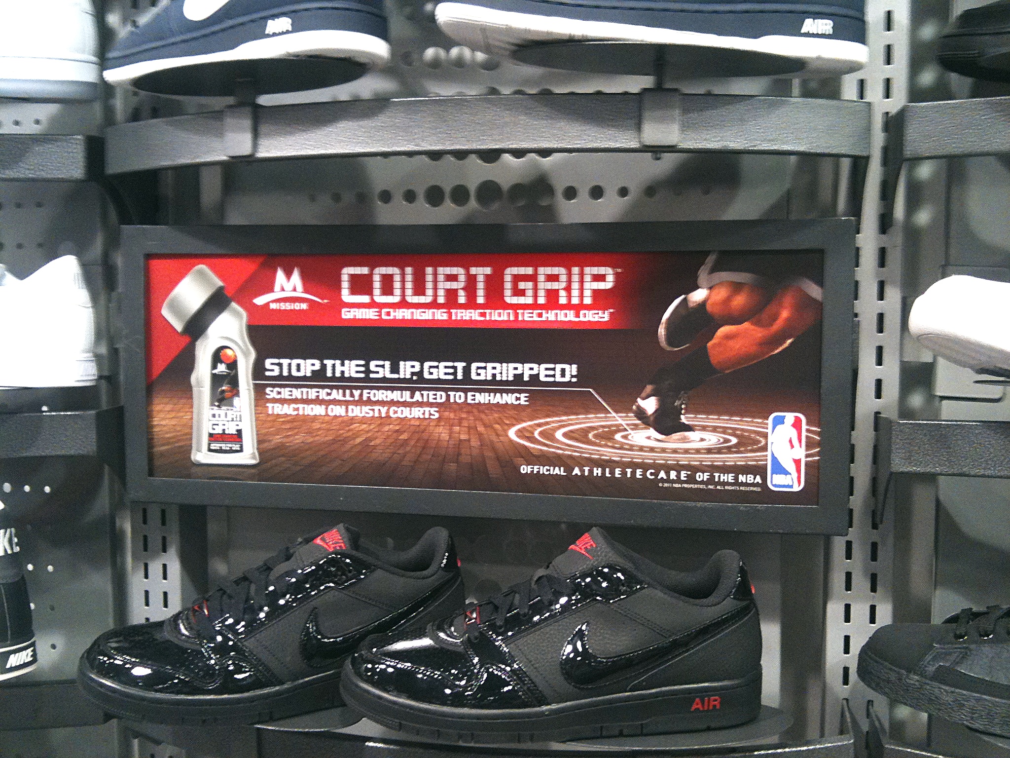
The Overhead Sign
A lightbox set into the shoe wall, carrying the roundel, the claim and the NBA mark. It is the highest the campaign reached in the room and the only piece a shopper reads before they are in the aisle.
The Facebook Page
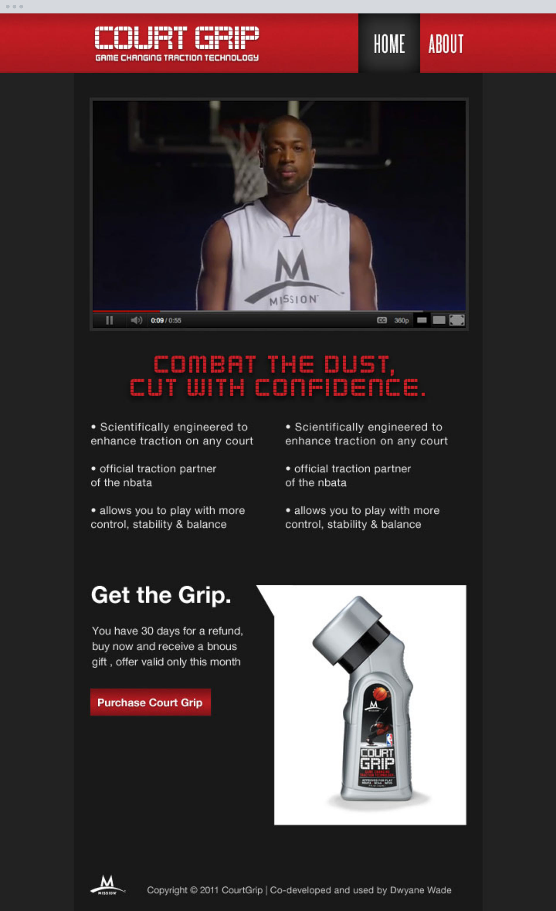
Foot Locker put the product into flagship stores and Mission sold it online, and in 2011 the brand's own presence was a Facebook page built in FBJS. It opens on the shoot video and closes on a thirty day refund offer with the bottle beside it.
The footer says it plainly. Co-developed and used by Dwyane Wade. The page exists because that sentence needed somewhere to live that a package could not reach, and because a product launching into a national chain needed an address before it had a site.
Foot Locker and Eastbay
Court Grip went into Foot Locker flagship stores and Eastbay with packaging, a sell sheet, three floor towers, two counter units, a range tray and a page behind it, all cut from one shoot and three sentences. For a product nobody could explain from a hook, that is a lot of shelf earned.
What holds up is the structure. One photograph of someone using the product, three commands short enough to split across a tower, and a ring diagram small enough to print on anything. Every piece after the first was an arrangement of those three, which is the part worth taking to the next brief.