Turner Design Firm
One kitchen and one awards entry, which won four awards across the International and USA Property Awards.
Summary
Overview
Turner Design Firm brought in outside help for one task. The task: a kitchen design entry called "The Value of Form and Function Engineering." It went to two award programs, the International Property Awards and USA Property Awards. The scope stayed narrow, one contest entry with strict rules. Working with designer Jeanine Turner meant matching her own style.
Challenge
The awards judge the design and the way the entry is made. The booklet had to follow every guideline. It also had to show Jeanine Turner's kitchen at the level the photos deserved.
Process
Working through the awards guidelines with Jeanine Turner so nothing in the entry would cost points.
Cover, contents, overview, concept stages, chosen design, details, materials, innovations, and testimonials.
A restrained layout that let the professional photography carry each spread.
Production-ready files checked against the submission requirements.
One Kitchen, Two Entries
The International and USA Property Awards both took the entry under Kitchen Design F10, and both judge the design and the entry itself. A weak booklet costs points a good kitchen has already earned. That is a different brief from making something look well made. Jeanine Turner had the room and the photography, so what the entry needed was a structure that stayed out of their way.
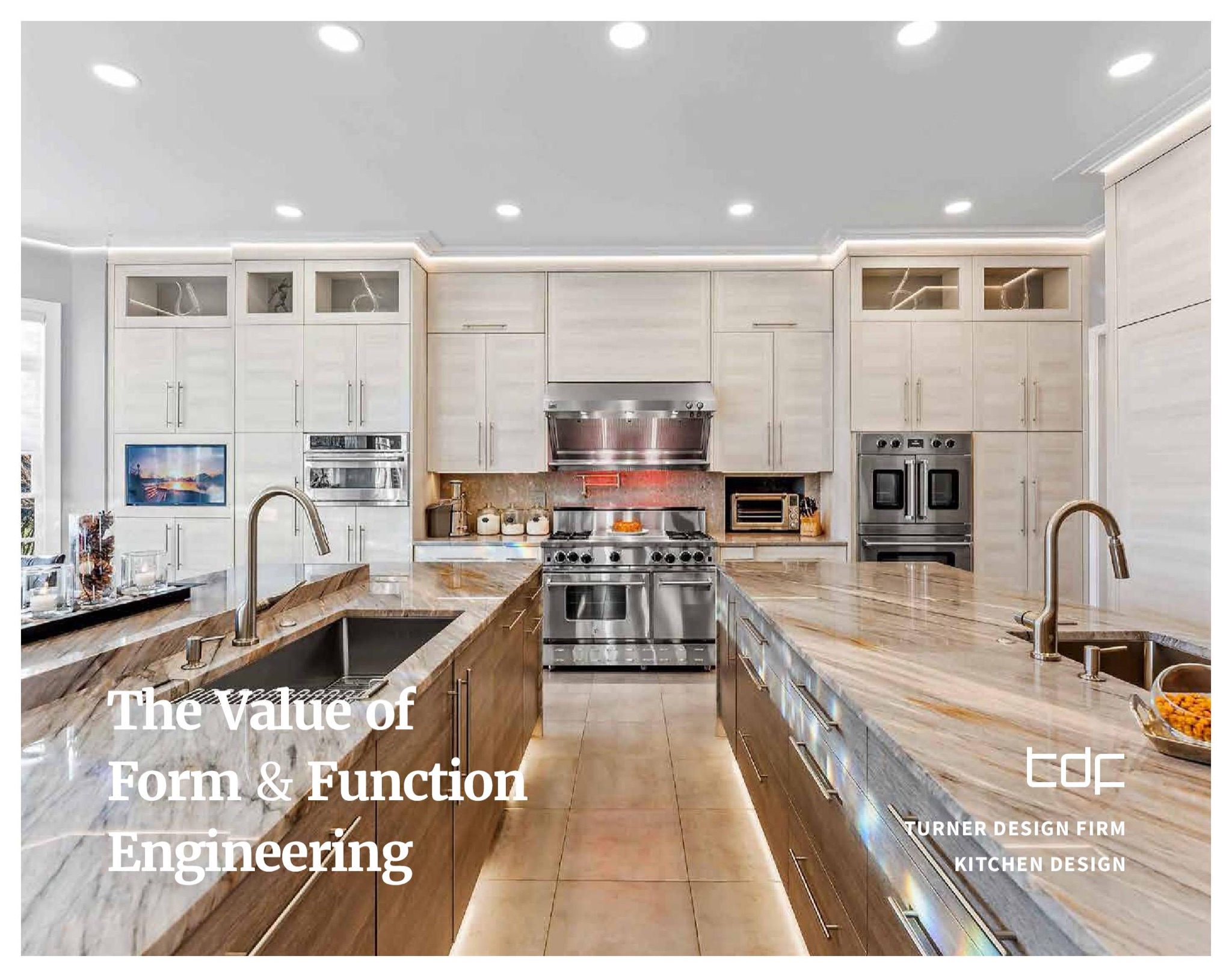
The Contents Page Is the Judging Rubric
The structure was not a design decision. The programs set out what an entry has to cover, and the table of contents is that list in order: Overview, Brief and Concepts, Area To Be Modeled, Budget, Final Design, Details, Chosen Materials, Innovations, Testimonials.
Lettering them A, B and C groups nine required subjects into three acts. A judge reading in order moves from what the kitchen is, to how it was arrived at, to what was built. The page numbers in the leaders do the other half of the job, so a judge checking one criterion can reach it without reading the rest.
A Letter Opens Every Section
Each act opens on a tinted page carrying its own letter, cut large and left as an outline, with the section name set beneath it. The facing page starts the content at full bleed.
It does one useful thing twice. A judge flipping to a criterion sees where a section begins without reading a word. The tint also gives the photography a moment of quiet before it starts again. The letter comes from the firm's own wordmark rather than the booklet's serif, so the device belongs to Turner and not to the entry.
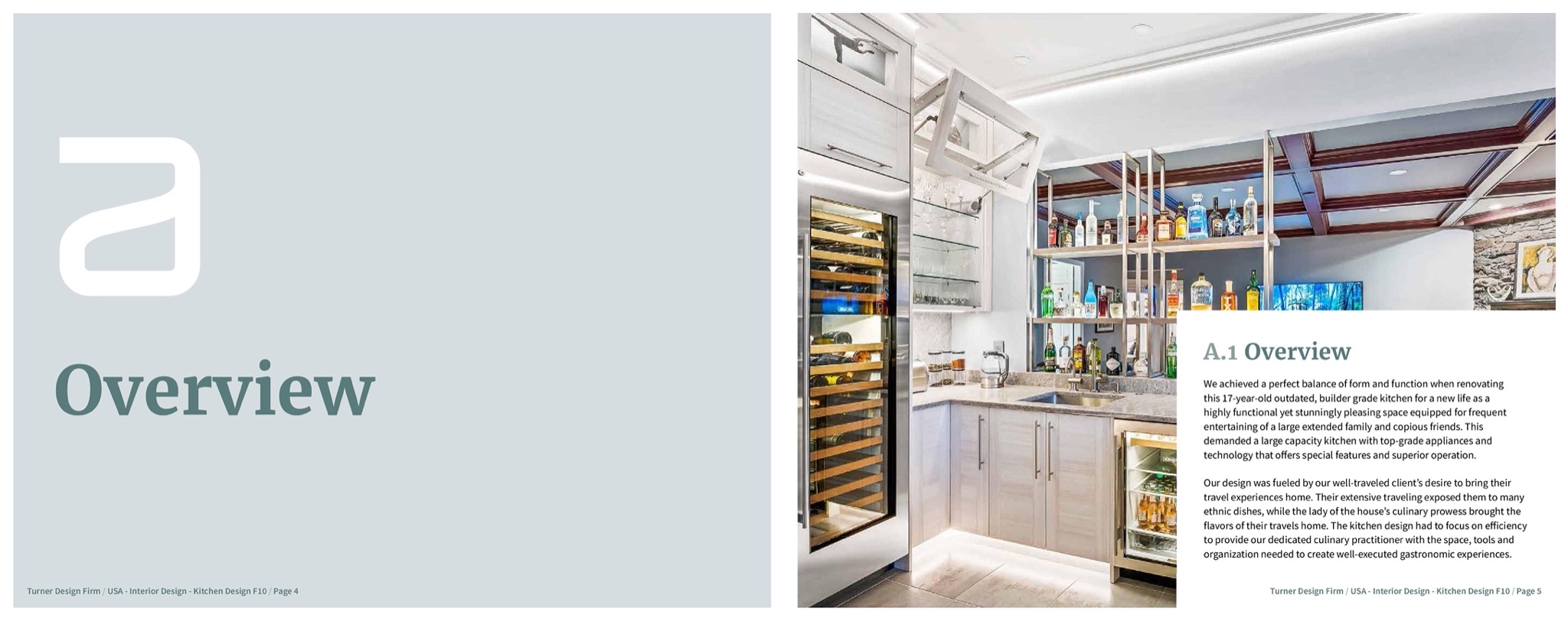
The Survey, Drawn by Hand
The brief section opens on the measured survey as it was drawn. Pencil on grid paper, every run dimensioned, the ceiling height noted in the corner.
It is the only page in the booklet that is not photographed or set, and it is there on purpose. The programs ask how a design was arrived at. A clean redrawing would have answered a different question. The sketch is evidence that the room was measured before it was designed.
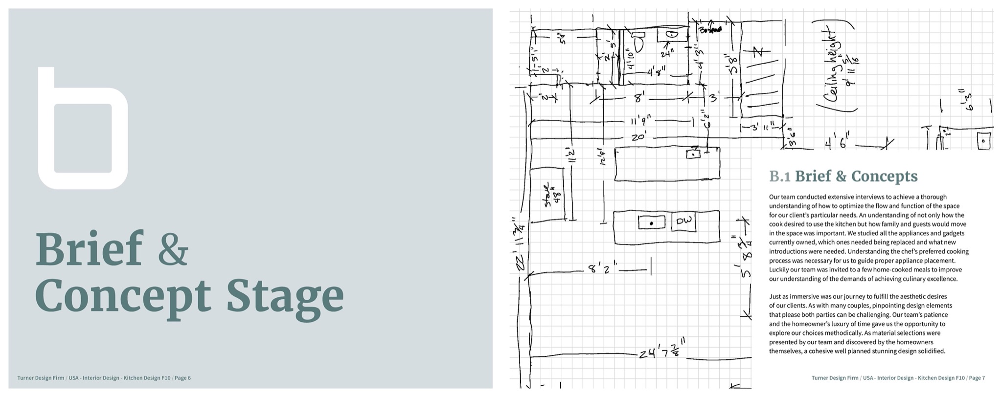
The Chosen Design
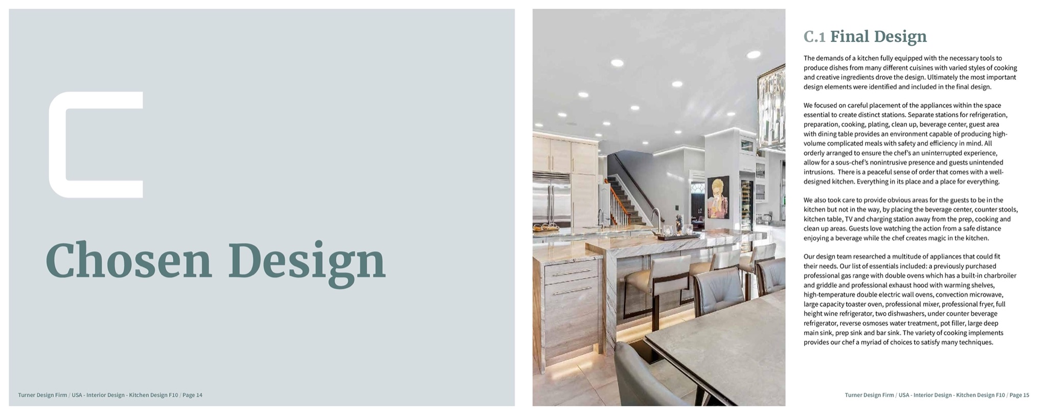
C.1 is where the entry stops explaining and starts showing. The copy gives the reasoning. Appliances were placed to make distinct stations, so the cook is never interrupted. The photograph runs the full height of the page beside it.
The ratio of the spread is the argument. One column of type against one uninterrupted image says the photograph is the work and the writing is a caption for it, which is the right way round for a kitchen.
Details, Organized by Station
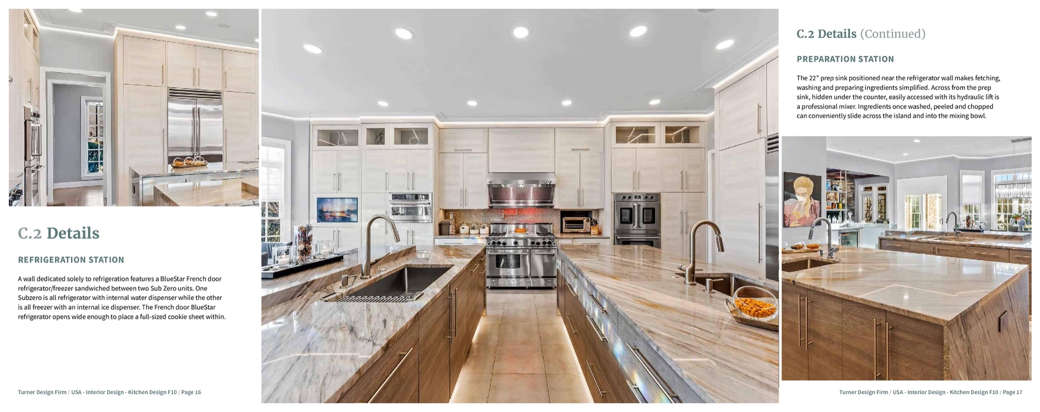
The details section breaks the pattern, and it is the only place that does. The photographs bleed off three edges. The copy sits in short named blocks, Refrigeration Station and Preparation Station.
Organizing by station rather than by wall is what the design itself does, so the pages read the way the kitchen works. It is also the longest section, seven pages, because it is the one a judge scores against a list.
The Materials and Their Fabricators
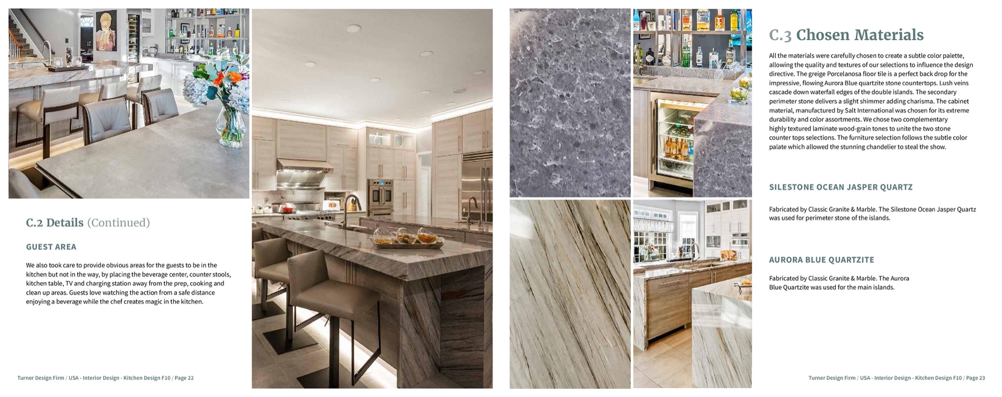
C.3 sets the stone and tile beside the rooms they are in, close up on one page and in place on the next. Each is named in full and its fabricator credited. Silestone Ocean Jasper Quartz went to the perimeter stone and Aurora Blue Quartzite to the main islands, both fabricated by Classic Granite and Marble.
Naming a material is a small thing that does a large one. A judge can check a specification. A reader can tell a palette that was chosen from one that was assembled.
The Owners' Testimonials
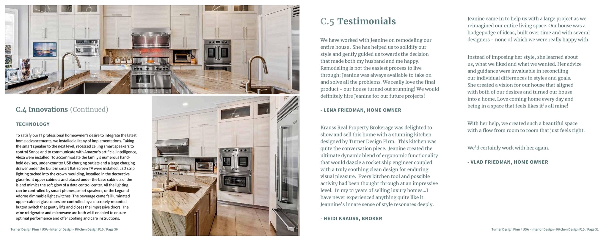
The entry closes on testimonials, set as plain columns with no photography. Two come from the homeowners and one from the broker who sold the house.
They are left long and in the owners' own phrasing. The broker notes that in twenty-one years of selling luxury homes she had not seen a kitchen like it. Trimming them to pull quotes would have made them sound written, which is the opposite of what a testimonial is for.
Four Awards, Two Programs
Two from each program, the USA pair at five stars.
One kitchen, one booklet, and a scope that never grew.